Magazine Planning
- sub genre - primarily a City-pop/future funk with secondary elements of EDM and electric mixed in to fit the audience and genre
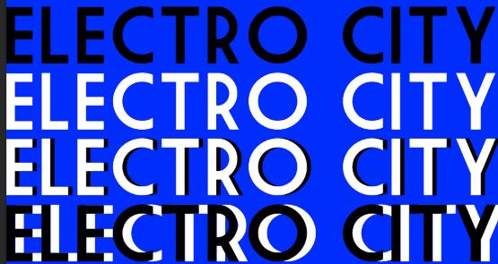
- Name - undecided, possible ideas = Mania, Euphoric, Dusk, Electro city, Blossom, Summer Days
- The magazine focuses on an already somewhat niche genre of City-pop and future funk, which are both sub genres of pop and electro that mix the 2 in a blend, this leads to the magazine having rots in electro style with the presence of DJ and EdM style music being present in the magazines identity and content. The magazine will hold the values of uplifting new and upcoming artists, celebrating the genres history and aiming to build a community amongst likeminded people with the same interest and similar lifestyles, allowing for a diverse audience brought together by a similar interest, with a focus on diverse representation to appeal to the widest margin in the niche section of 16-25 year old people. The magazine will include content consisting of interviews, reviews, top lists, and articles that share information about artists or genre/events.

-Mood board for house style and front, some elements will be reserved on contents

Possible article subjects
- Top 50 City pop songs of all time
- Looking back at the forefathers and how they made the genre what it is today
- Reminiscing on the greats, our list of the best hits
- Exclusive interview with (artist name)
- (artist name) and the story that brought them here
- (artist name) and who were their biggest inspirations?
- The rise of Future Funk and what it means
- Looking back on Anri's 'Timely' after 40 years
- The last tour by industry legend Masayoshi Takanaka
- The best live shows in 2024
- Our list of must see events for any British fan
- How AI will revolutionise EDM
- Drunken nights and the creation of (artist name and album)
- The rising star and their trail (artist name)
- the legacy of (artist name)
- Man and the machine
- The girl who revitalised the city
- Is (artists name and album name) a contender for album of the year
- Will (artists name) new album live up to the hype
- The revival of a forgotten legend
Contents pages within the genre often do not contain direct headings for sections and rather are simply separated by layout , e.g likely having one section dedicated to top lists and then another dedicated to the artist interviews, with the page numbers simply just being next to the headings1
Layout drafts

Main cover layout drafts

Contents page layout draft
will be mirrored to be double paged
Photoshoot ideas
- Setting - studio, possible use of outside with plants and sun, perhaps use green screen to place model into somewhere different, e.g a 3d background that resembles the city or futuristic style
- model - likely use 2 female models for the front of the magazine, with models of any kind on the contents, undecided but will likely have the clothing be more casual to reminisce on city pop,
- lowkey lighting with saturated colour
- stylised
Magazine drafting
https://www.dafont.com/market-deco.font?text=Euphoric&psize=l&back=theme

Masthead ideas - genre uses very simple mastheads, often just bold white or black text in sans serif font, with the image and design carrying the actual style and design of the cover
-The colour may change to fit the covers actual style, blue is used as a temp background colour
-Brand name 'Euphoric' or 'Electro city'
21-6-24
-Masthead design further
-Sound wave from 'Stay with me' most popular song in the city-pop genre


-White masthead
-May change colour of sound wave to fit the background image
-Euphoric will be the brand name


UPDATE SOI TO CHANGE THE COVER PLAN FOR THE NEW REPRESENTATION WHEN HAVE TIME
Image Planning

13-9-24
https://www.dafont.com/moonrising.font


23-9-24


-2nd cover started working, photoshoot done for contents and cover
-house style used in stylising artists name
-generation of barcode for magazines
4-10-24

-Recolour of certain colour lines for design
-date, barcode, cover line, issue number added
- Slogan - direct address to create the more personal feel to the magazine as usually seen with indie companies due to less restriction based on corporate leadership
- Integrated into the masthead which integrates genre conventions of magazines as a whole in which the slogan is established and maintained whilst not subtracting from any new content seen on the cover

- Barcode hidden amongst the masthead to grant a sleeker design that mimics the modernity of the genre
- issue number utilises a digital font that represents the modern and 'electrical' influence of the genre whilst being embedded into the masthead to maintain the sleeker design choice

- main cover lone
- Tacky design choice that aims to represent the indie elements however may need to altered due to seeming too tacky
- unique colour scheme for main cover line that aims to help mirror the artist, e.g here with the more traditionally feminine choice in a genre often dominated by men

- Cover lines need to be moved to left to fit magazine standard
- red cover lines should be more consistent and possibly changed to alleviate the tackier element that may not appeal to all audiences
- original intention to be the highlight of the covers which allowed for easy audience attention and direction towards key elements of the magazine however finished result lacks sophistication and modernity found in the genre of EDM
- The image's colour grading allows a complementation of the outside elements associated with the genre of country whilst maintaining a cooler more electronic feel having exaggerated blues and reds to display convergence

- Second cover made, utilises more sleek design choice with semi consistent colour elements
- red, black and white alongside an artist based colour in this case purple is utilised to be consistent across covers whilst maintaining some form of uniqueness, with black and white being used due to genre convention standardisation and the moderner look they grant
3-4-25
- Upon rework of website magazine redesign was deemed necessary
- pictures remain same and certain changes look subjectively worse however fit genre conventions and magazine style
- AIM - to remove the cheap effect created by text, clean-up the covers layout and inconsistent text spacing and sizing, keep a more consistent colour palette across all products (covers and website), utilise genre conventions more
- modernity is created through simpler bald and block text with standardised colours, the text aims to inform for the audience who is a mdi market audience with money to spare for going out and night and enjoys the scene whilst they are young both in home listening and getting to clubs after university/college or even work
- The covers still pertain a unique style to create digital feel implicit of the genre and the convergence between online and physical media
- This stylisation also allows the magazine to look indie with a niched audience (16-25 year old mid market) who enjoy EDM whilst maintaining a professional standard in terms of quality control and design the balder text looks more mature as well deterring a younger audience and removing audience feelings of distraught at the interpretation of it being aimed at a younger audience
- Cover lines have been moved from cover 2 to cover 1 due to fitting better with the website across both platforms, i.e artists referenced in both covers are now present on the website
- changes to cover 1 main image, matches the image style of cover 2 and the website
- cover line font changed - looks smoother and granted greater consistency in the production which meant greater efficiency and a greater and cleaner looking outcome
- cover line layout moved further left to reflect actual magazine conventions
- Date moved to top to be clearer
- Price tag added
COVER 1 FOR ISSUE 1 - UPDATED VERSION


COVER 2 FOR ISSUE 2 - UPDATED VERSION

- Layout altered to have cover lines on the left more allows for greater magazine convention following, furthermore movement of the date has made it easily visible by being on the left and the choice to move it to the top section allows it to be clearer in its black colour due to being outside of the shadows
- Addition of price tag to meet criteria, black and white sticker format chosen for realism
CONTENTS
- Changes from initial planning stage to a single page contents page
- both contents follow same simple format that utilises a plain back background with white text
- social media 'links' to show digital convergence and intersectionality between products
- images have been edited to flare with filters and alterations to colour hues/saturation - aims to keep a a more 'techno' style whilst also trying to keep brand identity with the luminescent altered images, keeps an independent feeling
COVER 1 CONTENTS PAGE
.png)
COVER 2 CONTENTS PAGE

- Social media links creates a modern cross convergence and the semi tacky style with logo embed in the contents allows for a greater independent feel due to indie content often relying on social media to promote itself in modern era
Tweaks

- decreased cover line size, moved main cover line to right, increased size of price
- allows better view of main image without covering face whilst still maintaining original intention
- price increase fits expected conventions

- red highlights on text changed to green in order to create greater readability and color synergy for the color


No comments:
Post a Comment